Omicron Research Institute
QuanTek Econometric & Technical Analysis Software
Model Portfolio
Most of the Graphs are too big to fit on the web page. So, we have provided a link to them and to other files such as Report files. To view these files in your web browser, just click the link. The files will open in their own tab in a separate web page. Then, to return to this web page, just click its tab in your browser. You can switch back and forth between tabs to compare the Graphs and Reports and then return to this web page.
Warning: The Price Projection represents the expected N-day prices. The error bars represent the expected N-day price range. These are estimates only. It is entirely possible for prices to end up outside the expected price range at any time.
It should be emphasized that the Price Projection cannot predict every short-term fluctuation in prices. It is based on past prices only, and cannot anticipate exogenous events such as news events that influence prices. However, it seems to give predictions that are at least plausible, and over a long-term average (1024 days or 4 years), yield significant correlation with future returns, according to the correlation tests.
Disclaimer: The graphs and analysis on this and other pages of this website are for illustrative purposes only, of the QuanTek program and general principles of Econometrics. They should in no way be construed as investment advice.
Note that the QuanTek program works with any security (Stocks, Mutual Funds, ETFs, Indexes), providing analysis and information to help determine a profitable trading strategy. It does not, however, select between different securities.
Tesla, Inc. (TSLA) (2019-04-26)
Here is the latest shot of Tesla (TSLA), on Scale 4:
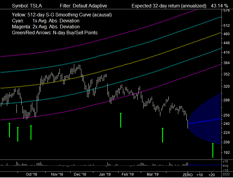
Unfortunately, Tesla suffered another slump this past week. This no doubt has to do with bad news involving a failure of a test rocket by the SpaceX corporation. As everybody knows, Tesla and SpaceX are both owned by billionaire Elon Musk; therefore the fortunes of both companies must be closely connected. (Or it could be for some completely unrelated reason.) In the above graph, Tesla has completely parted company with its long-term trend line -- the curved Bollinger Bands are an attempt by the 512-day S-G Smoothing Curve to make it back to this line. And the price action of Tesla is even below the Bollinger Bands based on this curve.
This, of course, is very unfortunate. We thought we were getting Tesla at a good price and it would "return to the mean". However, we have faith that this could still happen. The stock was a risky play to begin with -- as indicated by the very wide Bollinger Bands. However, if Elon Musk were to start having a string of successes, such a high-risk stock could suddenly turn around and move up just as fast as it has been moving down. So we will resign ourselves to the risk and hold on to this stock in the hope that its fortunes will reverse. Anyway, it is too late to sell now -- the price is already down. We will not make the mistake of selling when the price is down, and then watch with chagrin as the price immediately starts moving up again. The price has only been on an intermediate-term downtrend since December -- a period of four months. It could equally well turn around and move up just as fast over the next four months. In fact, if the price turns around and starts a new up-trend, then this would be an excellent buy point!
Portfolio Report (2019-04-05)
The Optimal Portfolio we are tracking for this week is displayed in the following QuanTek Report file:
Boeing seems to have made some good gains this week, recovering partially from the hit it took about three weeks ago. Evidently it is being vindicated, and also it has taken positive steps to correct the problem with its 737 aircraft, so that made a positive impression on investors.
Tesla took another hit the past couple of days, and was the only security in the portfolio to do so. This was a risky play in the first place. But Tesla has the potential for some major breakthroughs, and if they achieve one the stock should go up as fast as it has gone down recently.
JP Morgan has also made some nice gains this week, but is still below where it was bought. It was probably recovering from some bad news the previous week.
This was a good week for stocks in general. All the securities in the Model Portfolio enjoyed nice gains except Tesla. Maybe this is simply due to a relative lack of recent bad news and surprises.
Portfolio Report (2019-03-29)
The Optimal Portfolio we are tracking for this week is displayed in the following QuanTek Report file:
Boeing has been on an uptrend this week, so maybe this is an indication that it will be vindicated. Most likely they know what they are doing, and the problem with the aircraft was pilot error, as usual.
Tesla was also up this week. Maybe its fortunes are changing. But it is still below where it was bought a couple of months ago.
JP Morgan was up a little bit as well, but seems to be lagging overall. Probably this is due to expectations of rising interest rates being put on hold due to the risk of recession or other economic problems due to trade disputes.
Actually, all the securities in the Model Portfolio have done rather well this week. The market seems to have returned to its normal uptrend, as indicated by the graph of the Dow given above. Unfortunately, this does not leave too many opportunities to either buy or sell. If such is the case, it is best to hold and not take any drastic action. A stable, trending market is always best.
Portfolio Report (2019-03-22)
The Optimal Portfolio we are tracking for this week is displayed in the following QuanTek Report file:
Boeing seems to be holding its own, in spite of the recent news stories. They are the experts, it appears, even more so than the FAA, so probably they did not do anything wrong with the aircraft design. My guess is they will be vindicated and the stock will resume its uptrend.
Tesla was down even more this week. I am not sure why. But their fortunes could change dramatically so I see no reason to sell at this point.
JP Morgan has been down rather sharply the past four days. This is no doubt due to the news story early this past week about signs of an inverted yield curve for bonds. This is interpreted as a sign of an impending recession. But it does not seem to have impacted the market very much, although I remember the Dow was down intra-day in the news. So interest rates are not rising as fast as it looked like they would, and this will be bad for bank earnings. Rising interest rates would be good for bank stocks, but evidently bad for the overall economy, so the Fed has put that on hold. Maybe the economy is not as robust as it is made out to be.
All other stocks in the portfolio seem to be performing well and made gains this past week. So overall the Model Portfolio appears to be in good shape.
Portfolio Report (2019-03-15)
The Optimal Portfolio we are tracking for this week is displayed in the following QuanTek Report file:
Last week Boeing was at a possible short-term sell point. But I did not sell. Little did I know that a major news story would unfold this past week, involving two separate crashes of the 737 max 8 aircraft. These occupied the news for several days, and caused Boeing to take about a 10% hit. If I had made a short-term sell a week ago, then I could have bought it back this past Friday with about a 10% gain. However, here is my guess for the future: It will turn out that there is nothing wrong with the aircraft and that the fault was with the pilots, not understanding the systems in that airplane. Then Boeing will be vindicated and will resume its uptrend. So the 10% hit was most likely only short-term. Boeing seems to be on a strong long-term uptrend, and it would be a mistake to sell and miss the ride.
Tesla, on the other hand, seems to be having trouble. This was a risky stock to begin with, but its results have been disappointing so far. But if it were to have a string of successes, it could enter a strong upleg and make up for all the losses. This is supported by the Price Projection which predicts a strong 32-day return of 54.01%. So this appears to be a good stock for the risky side of the portfolio.
The Model Portfolio seems to have enjoyed some nice gains this week, all except Tesla. Apart from Tesla, the only remaining stock that is behind is JP Morgan. It appears that the bull market has resumed with steady, broad gains in the market. I cannot see any good buy or sell opportunities this week, although there are several stocks I wish I had bought, such as Intel. I did not buy them before because they did not appear undervalued, but nevertheless they have enjoyed substantial gains over the past few weeks.
Portfolio Securities (2019-03-15)
Here are some screen shots of the QuanTek Main Graph for various securities in the Optimal Portfolio:
Fig.1 BA-The Boeing Company (Scale 8): Boeing appears to have been in a short-term overbought condition prior to this past week. But it appeared to be re-joining a longer-term trend. Perhaps it could have been sold last week for a short-term trade. But it could just as easily have remained on an uptrend. However, this past week there was a negative news story about two related crashes of the 737 max-8 aircraft, which causes a short-term setback in the stock. If I had done the short-term sell, I would have bought it back at this point. Boeing appears to be weathering the negative news story well and will probably resume its uptrend. This is supported by the expected return of 33.51% from the Price Projection.
Fig.2 TSLA-Tesla, Inc. (Scale 4): Tesla has given a disappointing performance since it was bought previously at a depressed price. It is at the lower range of its Bollinger Bands, indicating an oversold condition, but the 32-day Price Projection is a very healthy 54.01% (annualized). This is to be contrasted with its long-term trend line which is giving a healthy 49.86% return. This is a somewhat risky stock, with wide Bollinger Bands. The intermediate-term trend appears flat, but the Price Projection has latched on to the long-term trend as the dominant trend. It appears that I got this stock at a good price, and hopefully after riding out the intermediate-term trend it will resume its uptrend and give a robust long-term return.
Fig.3 NFLX-Netflix, Inc. (Scale 4): Netflix appears to have made a nice recovery from the selling climax of December and now has an expected return due to the Price Projection of 10.01%. This is to be contrasted with its long-term trend line which is giving a healthy 52.44% return. Netflix reached a peak in June and was in a strong intermediate-term down-trend afterward. But now it appears to be trying to re-join its healthy long-term uptrend. Also notice that this is a rather risky stock with wide Bollinger Bands. The prices are near the center of the Bollinger Bands at this point, so they are neither overbought nor oversold.
Fig.4 FB-Facebook, Inc. (Scale 4): Facebook appears to be trying to recover from its dramatic down-trend starting with a serious gap in July, and establish a new up-trend. It gapped up again near the beginning of February. Since then it has been more or less flat for the past six weeks or so. It is below its Bollinger Bands, indicating an oversold condition. This is reflected in the Price Projection of 34.84%, a reflection of the return to the mean mechanism. In fact the Price Projection for Facebook corresponds more or less to its rather healthy long-term trend of 36.52%, so it is actually taking a neutral position, just as the Random Walk model would predict. The upside potential appears promising if Facebook can return to its previous strong uptrend.
Fig.5 MSFT-Microsoft Corporation (Scale 4): Microsoft appears relatively healthy, with only a small breakdown during the selling climax of December, during which it stayed within its Bollinger Bands. The Price Projection of 38.29% predicts a continuation of the ongoing intermediate-term up-trend, and in fact this should surpass the long-term trend of 23.54%. The prices are near the top of their Bollinger Bands. This seems to indicate a continuation of a strong long-term uptrend, although it is possible that the stock could be a little overbought and due for a small correction.
Fig.6 AAPL-Apple Inc. (Scale 4): This graph shows the major breakdown in Apple since the middle of October to the selling climax of December, but it is not as bad as it seems, since Apple started out very overbought to begin with. Now Apple seems to be making a nice recover and is in an intermediate-term up-trend. The Price Projection is a healthy 23.65%, to be contrasted with the long-term trend of 21.34%. The prices are still below the centerline of their Bollinger Bands. But the long-term trend is very well established, and it is hard to believe that Apple will stay depressed very much longer. It should have a tendency to return to its long-term trend, which is what the Price Projection shows.
Portfolio Report (2019-03-08)
The Optimal Portfolio we are tracking for this week is displayed in the following QuanTek Report file:
Once again, Boeing appears to be a possible sell candidate at current levels. It has had a very impressive run-up since December. However, its Price Projection yields an expected 32-day return of 37.11%, so we will hold for now. The overall price pattern shows impressive gains since about September 2016, and the current run-up appears to be a part of this trend, although over the shorter-term it appears somewhat overbought. But the Price Projection is very positive -- if it were negative then now would be an excellent sell point.
Another security that shows a lot of promise is Microsoft. Its Price Projection yields an expected 32-day return of 37.84%, and it has also enjoyed a substantial run-up, although not as dramatic as for Boeing. So this stock is also a hold at the present time.
The Model Portfolio this week is continuing to show a profit, greater than a month ago. We are still lagging (slightly) on Amazon, JP Morgan, and more substantially on Tesla. But we have made an impressive gain on Facebook and especially Boeing. So the Buy-Low, Sell-High strategy seems to be working. Hopefully the trouble with Tesla will only be temporary, and it will prove in the end to be a lucrative investment. The Price Projection gives an expected 32-day return of 54.80%, so we will give it the benefit of the doubt for now.
Portfolio Securities (2019-03-08)
Here are some screen shots of the QuanTek Main Graph for Boeing on all five scales (wide screen):
Fig.1 BA-The Boeing Company (Scale 16): On the largest scale, the recent price run-up for Boeing from the selling climax of December up to a week ago is shown clearly. On this scale, it appears that Boeing has gone from an oversold condition to an overbought condition, at least relative to the Bollinger Bands. Normally this would mark an excellent intermediate-term sell point. However, due to the expected 32-day return of 32.11%, we should think twice about this. In this graph, the Candlesticks are shown in light and dark blue, and the green triangles mark the 32-day projected price (price target). (As is well known from the Random Walk model, the expected return is always relative to the current price point.) The green rectangles mark the long signals, which are points where the Adaptive filter is positive and above the Threshold setting.
Fig.2 BA-The Boeing Company (Scale 8): On this scale, the recent price history of Boeing begins to provide some perspective. There aren't any buy signals, which means that the Relative Price (low-pass) indicator is not below its Range setting. (In fact, it is actually positive.) So to buy would be purely a momentum play, not a value play. It can be seen that the prices have been somewhat volatile since the Fall of 2018. Notice, however, that the prices were fairly close to the center of the Bollinger Band up until the selling climax which started in November, then when the prices recovered back to this level around the beginning of February, there was a sizable gap upward. Extending the Price Projection backward, it appears to point to the price levels as they were in the Fall of 2018 before the selling climax. So this Price Projection seems to be indicating that a valid intermediate-term trend is in effect.
Fig.3 BA-The Boeing Company (Scale 4): On this scale, more historical perspective on the price action over the past year is indicated. It appears that there was a strong run-up in Boeing up until about June 2018, after which the prices leveled off a bit. It was evidently this strong previous run-up that influenced the Price Projection to give such a bullish indication. The Price Projection, indeed, appears to point directly to this past run-up which took a pause around June 2018. So it is interpreting the recent strong run-up since December as merely a return to and continuation of this bullish trend. Notice also the buy points near the bottom of the selling climax. These indicate dips in the Relative Price (band-pass) indicator. There is also one in April 2018, where it appears that the stock is going to continue its strong uptrend.
Fig.4 BA-The Boeing Company (Scale 2): This scale gives even more historical perspective, going back to January 2016. On this scale, the 2048-day trend line is shown instead of Bollinger Bands. Relative to this trend line, Boeing appeared to be fairly valued during the selling climax, a consequence of its dramatic run-up between January 2016 and January 2018, at which point it appears rather overbought. The the selling climax just brings prices down to the point just before the peak of the run-up that ended in January 2018. So the selling climax was not as serious as it appeared, at least for Boeing. This shows the real value of the historical perspective. From this perspective, the Price Projection seems to point back to the peak of the run-up in January 2018, and does not even take into account this run-up prior to that point. In fact, it is very close to the 2048-day average return of 28.32%. No doubt the average return since January 2016 would be even greater.
Fig.5 BA-The Boeing Company (Scale 1): Finally, the longest-term scale shows the price action going back to 2012 (or even further back to the full 2048 days, if only my screen were bigger). This scale shows some long-term cycles superimposed on the long-term trend. From this perspective, you could say that the Price Projection gives an expected return that takes into account the entire 2048-day price history, and yields a best estimate based on this history. So this estimate appears to be less than the average run-up since January 2016. But for a long-term investor, it appears that the 2048-day average return of 28.32% is still intact. Note also the 200-day simple MA (relative to the trend line) on this scale.
Portfolio Report (2019-02-08)
Sorry to have fallen behind on the Model Portfolio -- my hard drive crashed and it has taken awhile to get up and running again.
The Optimal Portfolio we are tracking for this week is displayed in the following QuanTek Report file:
I did not see any good buying opportunities again this week. I strongly considered taking a profit on Boeing, given the impressive run-up it has enjoyed over the past several weeks, but finally decided against it. Boeing seems to be on a good run even though it appears to be near the top of a trading range. Looing at it over the longer term, it appears to have returned to the uptrend it has been on since January, 2018. This is corroborated by the impressive Price Projection of 37.91%. So I decided it would be a mistake to get out at this time, and that Boeing should be given more room to run.
The Model Portfolio this week is continuing to show a profit. This is due to gains in Facebook and Boeing, and a slight gain in Microsoft. Meanwhile Apple and Amazon are showing a slight loss. Tesla and JP Morgan are still showing more substantial losses. But the remaining stocks showing a loss will probably recover shortly once the market is fully recovered from the recent sell-off. JP Morgan should do better once interest rates begin to rise. Hopefully there will be no more shocks to the market, and all of these securities can soon resume their up-trend. Let us hope there is not another government shut-down in a week or so. To go through that again might rattle the markets severely.
Portfolio Report (2019-02-01)
The Optimal Portfolio we are tracking for this week is displayed in the following QuanTek Report file:
I did not see any especially good buying opportunities this week. I considered taking a profit on Boeing, but finally decided against it. Boeing seems to be on a good run even though it appears to be near the top of a trading range. As for Netflix, I seriously considered buying at this point. It has not pulled back much since its steep run-up, and appears to be stable on its long-term trend curve. However, it seems a little precarious, and the Price Projection is not very favorable, at only 6.66%. This is the main reason why I did not buy at this point. Perhaps it would be better to wait for the next pull-back to buy.
The Model Portfolio this week is continuing to show a profit. This is due to gains in Facebook and Boeing, while Microsoft and Amazon are showing a slight loss. The other stocks are still below their basis price. But they will probably recover shortly once the market is fully recovered from the recent sell-off. Hopefully there will be no more shocks to the market, and all of these securities can resume their up-trend. Let us hope there is not another government shut-down in a couple of weeks. To go through that again might rattle the markets severely. (Then again, maybe the markets have already discounted that possibility. This might explain why the recovery from the selling climax has been so long and drawn-out.)
Portfolio Securities (2019-02-01)
Here are some screen shots of the QuanTek Main Graph for Netflix on all five scales (wide screen):
Fig.1 NFLX-Netflix, Inc. (Scale 16): Netflix seems like an interesting study this week. The first graph shows NFLX on the largest scale, Scale 16. On this scale, the entire price action of the past few months does not even fit on the screen. This scale is best for checking the daily price action, which is shown by Candlesticks. Also shown are the N-day Long/Short Signals derived directly from the Price Projection, which is displayed for each day (that it is above the Threshold level) as an N-day Price Target. The Bollinger Bands are so wide that they do not even fit on the screen.
Fig.2 NFLX-Netflix, Inc. (Scale 8): On Scale 8, we begin to be able to see the complete price action for the past 8 months or so. This scale shows an intermediate-term downtrend that started in June 2018 and ended with the selling climax of December 2018. This ended in a sudden dramatic uptrend that lasted until the middle of January. Then there was a short pull-back, followed by a trend reversal to the upside a week or two ago. The Price Projection is only a meager 6.66%. This is no doubt due to the price action just described, with conflicting short-term (up), intermediate-term (down), and long-term (up) trends. This seems like a risky buy at present -- the short-term uptrend could give way once again to the intermediate-term downtrend, with a significant loss over the short-term.
Fig.3 NFLX-Netflix, Inc. (Scale 4): On Scale 4, we see the price action going back about 18 months. NFLX was in a strong uptrend until the middle of June, 2018, when it peaked and then entered its intermediate-term downtrend, lasting about 6 months until the selling climax of mid-December. The subsequent short-term uptrend starting in mid-December 2018 looks very much like the one starting in mid-December 2017. Clearly, with hind-sight the best buy opportunity would have been at the depth of the selling climax. But due to the intermediate-term downtrend, this proposition looked dubious.
Fig.4 NFLX-Netflix, Inc. (Scale 2): On Scale 2, we see the price action going back about 3 years. This shows the strong long-term uptrend that NFLX was in starting in February 2016, at the end of another selling climax that month. It appears the stock got a little ahead of itself starting in February 2018, and became overbought from February to October, 2018. On this graph, we see the long-term (robust) 2048-day Trend Line, and the 2048-day (annualized) return, which is 51.02%. So this justifies our expectation that, over the long-term, NFLX has been and will be a strong performer. However, along with the robust returns, there is also a high degree of risk, as is evident from the very wide Bollinger Bands.
Fig.5 NFLX-Netflix, Inc. (Scale 1): Finally, on Scale 1, we see the price action going back about 6 years. The entire price action is 8 years (2048 days) long, and is contained in a single graph, but I was not quite able to get the whole graph into a screen shot. This graph shows once again the long-term uptrend that NFLX has enjoyed since mid-2012. Before that, it went through some wild gyrations for a couple of years. These early gyrations no doubt account for most of the risk in the stock and the wide Bollinger Bands. On this scale, the recent overbought condition and then the selling climax look like just minor fluctuations.In fact the overbought condition looks very much like the period from the end of 2014 to the middle of 2015, which also ended in a selling climax around August 2015. So if history repeats itself, it looks like NFLX is about to enter once again a relatively stable period of growth in another long-term uptrend, as it did from August 2015 to mid-2017.
Portfolio Report (2019-01-25)
The Optimal Portfolio we are tracking for this week is displayed in the following QuanTek Report file:
I have decided it is time to buy some Amazon this week. The price seems to have stabilized this past week, with no pull-back to speak of, and the Price Projection is favorable. As for Netflix, it showed only a minor pull-back last week after its very steep run-up of the previous two weeks. However, it seems a little precarious, and the Price Projection is not very favorable, although still positive. Perhaps it would be better to wait for the next pull-back to buy.
The Model Portfolio this week is continuing to show a profit. This is due to gains in Facebook, Microsoft, and Boeing, while Tesla is once again showing a loss. The other stocks are still below their basis price. But they will probably recover shortly once the market is fully recovered from the recent sell-off. Hopefully there will be no more shocks to the market, and all of these securities can resume their up-trend.
Portfolio Securities (2019-01-25)
Here are some screen shots of the QuanTek Main Graph for various securities in the Optimal Portfolio:
Fig.1 AMZN-Amazon.com Inc. (Scale 4): Amazon looked like it was in a good position to buy, so I bought some this week. I was concerned about a possible short-term pullback, but there is no evidence of it this week and the price appears firm, at least for now. The Price Projection is a favorable 24.02%, and the Sharpe Ratio is also pretty favorable at 89.38%. The price right now appears to be very close to its long-term trend, so maybe if there is not too much turmoil out of Washington, Amazon will enter the next upleg.
Fig.2 NFLX-Netflix, Inc. (Scale 4): Netflix,appears to have undergone a slight pullback after its meteoric runup over the past couple of weeks, but less of a pullback than expected. This is somewhat worrisome, and also the Price Projection is not very good at a measly 4.93%. This stock is also very risky as can be seen from the wide Bollinger Bands and Standard Deviation of 48.07%. So I will pass for now on NFLX, but possibly buy later at a more favorable price, after the next pullback. Let's wait and see whether we have another government shutdown in three weeks!
Fig.3 MSFT-Microsoft Corporation (Scale 4): Microsoft appears stronger than some of the other stocks, as it was not affected quite so much by the recent selling climax. The Price Projection is a very healthy 41.88%, and it is sitting right on its long-term trend curve, so it neither overbought nor oversold. It also has a very respectable Sharpe Ratio of 106.77%. The risk is also low with narrow Bollinger Bands and a Standard Deviation of 21.67%. So I expect it to remain a top performer in the months to come.
Fig.4 CSCO-Cisco Systems, Inc. (Scale 4): Cisco appears to be another strong stock, although not quite as strong as MSFT. It has recovered nicely from the selling climax and shows a Price Projection of 17.20%. The Sharpe Ratio is 58.92%, respectable but not stellar. Like MSFT, this stock is sitting right on its long-term trend curve, so it neither overbought nor oversold. This looks like a good, stable stock to own, but I will wait until it is in an oversold condition to buy it.
Fig.5 JPM-JP Morgan Chase & Co. (Scale 4): JP Morgan is also recovering nicely from the recent selling climax, although it still appears somewhat oversold. Perhaps its lack of robustness is due to predictions of an economic slowdown and slower interest rate rise (which should help the bank stocks, while hurting others). This is a good stable stock, however, with narrow Bollinger Bands, a Price Projection of 18.96%, and a Sharpe Ratio of 71.62%. So it should be a good performer over the long-term, and also provide a bit of diversification for the portfolio.
Fig.6 IBM-International Business Machines (Scale 4): IBM seems to have had a rocky ride the past four months or so, since the beginning of October. It broke down seriously in October, well before the selling climax in December. Apparently it was suffering from some bad news of some sort. But last week it suddenly gapped upward, so maybe the bad news is over. This is, of course, a good, stable blue-chip stock with a long history and narrow Bollinger Bands. However, it must have been flat or negative for the past 8 years, because its Sharpe Ratio is a dismal -7.92%. Its Price Projection is also dismal at 1.78%. The stock seems to have gapped up suddenly to close to its long-term trend curve. But without any upward growth, it does not seem like much of a buy prospect, at least at this point. Maybe IBM's artificial intelligence business will eventually bring new life to its stock.
Portfolio Report (2019-01-18)
The Optimal Portfolio we are tracking for this week is displayed in the following QuanTek Report file:
The situation this week has not changed much from last week. The Model Portfolio this week is continuing to show a profit. This is due to gains in Facebook, Tesla, and Boeing. The other stocks are still below their basis price. But they will probably recover shortly once the market is fully recovered from the recent sell-off. Hopefully there will be no more shocks to the market, and all of these securities can resume their up-trend.
Just as last week, I don't see any good buy opportunities this week. I am still tempted to buy Amazon, due to its favorable Price Projection. However, it looks like it might be poised for another short-term down-trend. So I will wait for the next pull-back to buy this one. Netflix had a very sharp jump upward this past week. But now it is too high-priced, at least over the short-term, and poised for a possible short-term pull-back. It now has a slightly positive Price Projection. But I think it would be wise to wait to buy on the next pull-back. These are the only two stocks in the portfolio with favorable Sharpe Ratio, that I have not already bought.
Portfolio Securities (2019-01-18)
Here are some screen shots of the QuanTek Main Graph for various securities in the Optimal Portfolio:
Fig.1 AMZN-Amazon.com Inc. (Scale 4): Amazon looks like a tempting buy at this point. It appears to be in a long-term uptrend and a short-term uptrend, but possibly in a intermediate-term downtrend. It has had an impressive short-term runup since the selling climax in mid-December. However, due to the overall downtrend since the beginning of October, the short-term uptrend could reverse and become a short-term downtrend. So it might be better to wait for a pullback, then buy in anticipation of the next market upleg (either intermediate-term or long-term).
Fig.2 NFLX-Netflix, Inc. (Scale 4): Netflix, like Amazon, appears to be in a long-term uptrend and a short-term uptrend, but possibly in a intermediate-term downtrend. In this case the intermediate-term downtrend has lasted since June-July 2018. This stock has had a meteoric runup over the past couple of weeks, more so than Amazon. It is obvious that this runup can't be sustained. There will almost certainly be a short-term pullback after such a runup. When this occurs then it might be a favorable buy opportunity, as it seems to suggest that the intermediate-term downtrend has been broken. Maybe then the stock will resume its long-term uptrend.
Fig.3 TSLA-Tesla, Inc. (Scale 2): Over the past 2048 days (8 years), Tesla has been in a long-term uptrend with an average (annualized) return of 50.18%. However, over the past 18 months or so, the stock has been in a flat trading range over the intermediate-term. This stock is also very risky, as can be seen from the very wide Bollinger Bands. So to get into this stock involved having faith that the stock would resume its rather dramatic long-term uptrend. As a matter of fact, we have already made a profit on this stock, and if it resumes its long-term uptrend, then we will be handsomely rewarded. Tesla must have run into a bit of bad news on Friday, but it is near its lower Bollinger Band, so we still think it is near a favorable long-term buy point. Maybe it will now break out of its trading range and resume its long-term uptrend once more.
Fig.4 FB-Facebook, Inc. (Scale 4): Facebook also appears to be making a nice recovery from the recent selling climax of mid-December. It also appears to be breaking out of its intermediate-term downtrend. Due to bad news over the past year, the stock is way below its Bollinger Bands, but provided we have faith that Facebook can recover from its recent troubles, we may interpret this as an extreme oversold condition. So it appears that we chose a favorable buy point for this stock, and as a result it is already showing a profit. It looks like Facebook has a long way to go to the upside, so when the market starts a new upleg, the profit potential could be substantial. Surely this company will remain a pivotal tech company, and so I expect it to return to its former upward trend sooner or later. Notice that the Bollinger Bands are widely spaced compared to many older companies, which indicates that it is relatively volatile (hence risky).
Fig.5 AAPL-Apple Inc. (Scale 4): Apple has not made a very robust recovery from the sell-off of the past 3 months. It went from a very overbought condition in September and October to a very oversold condition now. It started to recover from the selling climax of mid-December but then stumbled. Apparently this is due to bad forecasts for sales of the i-Phone in 2019. But Apple is a great company and will no doubt recover from this news event. In fact, for the long-term, Apple appears to be at a very favorable buy point. It appears to be trying to establish a short-term uptrend over the past couple of weeks. If this uptrend can continue, then Apple has a lot of room to run on the upside.
Fig.6 BA-The Boeing Company (Scale 4): Boeing has also had a nice runup over the past couple of weeks. This stock was much less affected by the intermediate-term downtrend than some of the others. It did go through a milder version of the recent selling climax, but since then has recovered nicely. This is a more stable and less risky stock than most of the others, as can be seen from the relatively narrow Bollinger Bands. This stock has also been in a trading range the past year or so, and currently is right in the middle of its Bollinger Bands, so we may hope that it is getting ready for a new long-term upleg. In spite of being up short-term over the past couple of weeks, the 32-day Price Projection is a healthy 36.39%, indicating that the well-established long-term trend will resume.
Portfolio Report (2019-01-11)
The Optimal Portfolio we are tracking for this week is displayed in the following QuanTek Report file:
The Model Portfolio this week is showing a profit once again. This is due to gains in Facebook, Tesla, and Boeing. The other stocks are still below their basis price. But they will probably recover shortly once the market is fully recovered from the recent sell-off. Hopefully there will be no more shocks to the market, and all of these securities can resume their up-trend.
I don't see any good buy opportunities this week. I am tempted to buy Amazon, due to its favorable Price Projection. However, it looks like it might be poised for another short-term down-trend. So I will wait for the next pull-back to buy this one. Netflix had a very impressive jump upward this past week. But now it is too high-priced, and poised for a possible short-term down-trend. Also it has a slightly negative Price Projection. So maybe it will be a good buy on the next pull-back.
Portfolio Securities (2019-01-11)
Here are some screen shots of the QuanTek Main Graph for the Standard & Poors 500 (.SPX). These illustrate the recent selling climax within the context of the long-term trend of the S & P 500 index, on three different scales.
Also shown are some screen shots of the QuanTek Splitter Windows for the Standard & Poors 500 (.SPX). The first two Splitter Windows represent three different Indicators, with low-pass smoothing and band-pass smoothing. The third Splitter Window shows the output of the Adaptive Filter directly and associated indicators:
In the first two Splitter Windows, the three indicators shown are Relative Price, which is the price action relative to the 512-day smoothing curve, the Velocity, which is the returns or daily price differences, and the Volatility, which is the absolute deviation of the daily returns. All of the indicators are smoothed using N-day Wavelet Smoothing, and they are all causal (except the Range and Threshold lines themselves, which depend on taking an average over the whole indicator). The most important indicator in each case is the Relative Price. The Volatility indicator is relative to zero for Low-Pass Smoothing, but relative to its mean value for Band-Pass Smoothing.
Fig.1 .SPX-Standard & Poors 500 (Scale 8): This graph on Scale 8 shows the recent selling climax of the past several weeks. It made a partial, but not complete, recovery back to previous price levels. It appears that the recovery hit resistance at a price level about equal to the previous support level. This is probably due to the ongoing political turmoil coming out of Washington, and in particular the government shutdown, which tonight has become the longest in US history. The prices appear very oversold, being quite a bit below the Bollinger Bands. Hopefully if, and when, the political turmoil subsides, maybe the index will recover back to its long-term trend. However, note in this graph that QuanTek is giving a Buy Signal (green rectangles). This comes from the Relative Price (Low-Pass) Indicator (Fig.4) being below the Range setting, while the Adaptive Filter Output (Fig.6) is positive. In fact, the Adaptive Filter Output (Fig.6) is also above its Threshold setting, so it is also giving a Long Signal (not shown on this graph).
Fig.2 .SPX-Standard & Poors 500 (Scale 4): This graph on Scale 4 gives a little more historical perspective. Once again, the selling climax is below the outer Bollinger Band, which follows the 512-day S-G Smoothing Curve, indicating an oversold condition. Previous to that the index appeared a little overbought. On this graph are also indicated some Buy Points. These indicate inflection points in the Relative Price (Band-Pass) Indicator (Fig.5), as can be seen in Fig.5. These Buy Points are indicated by vertical green lines in all the Indicator graphs and green arrows on the Main Graph. They are triggered when the Relative Price (Band-Pass) Indicator (Fig.5) goes through a minimum outside the Range setting, while the Adaptive Filter Output (Fig.6) is positive. They indicate possible favorable buy points in case you want to time your trades, or possibly for swing trading. (Analogous statements apply to the red Sell Points.)
Fig.3 .SPX-Standard & Poors 500 (Scale 2): This graph on Scale 2 gives even more historical perspective. Also this graph is plotted relative to the 2048-day (robust) Trend Line. Relative to this long-term Trend Line the selling climax still appears to be an oversold condition. As of now, the prices have recovered back to the outer Bollinger Band, which this time follows the 2048-day Trend Line. In all these graphs, it can be seen that the Price Projection has latched on to the well-established long-term trend and is following it closely. It was not even significantly affected by the sell-off. This should be a reflection of the fact that the sell-off was just a short-term anomaly, due to exogeneous news events, which from the long-term perspective is just a minor feature of the graphs. Almost the opposite type of anomaly occurred in January, 2018 when the market became overbought for a few weeks, then recovered. From past experience we can infer that the market will probably recover and resume its upward trend within the Bollinger Bands, in a few months time.
Fig.4 .SPX-Indicators (Low-Pass Smoothing): These indicators are smoothed using Low-Pass Smoothing, similar to a moving average. The bottom indicator is Relative Price, and it serves as an indicator of overbought/oversold conditions. It can be seen that for the past couple of years, the indicator has been relatively flat, indicating that prices have stayed close to their long-term trend line. Recently, however, prices have entered an oversold condition, triggering a Buy Signal. The Range control sets the level at which Buy/Sell Signals are triggered. Note also the increased Volatility.
Fig.5 .SPX-Indicators (Band-Pass Smoothing): These indicators are smoothed using Band-Pass Smoothing, similar to the difference of two moving averages. The bottom indicator is Relative Price, and it serves as an indicator of N-day inflection points, similar to an oscillator indicator. These are shown on the graphs as the N-day Buy/Sell Points. With the recent downturn, it can be seen that this indicator shows a strong Buy Point. The Range control also sets the level at which the Buy/Sell Points are triggered. Actually, we don't use these Buy/Sell Points, but they are convenient for lining up features on the graphs. They might be useful for N-day Swing Trading, however, if you are downloading data every day.
Fig.6 .SPX-Adaptive Filter Output: These three indicators pertain to the Adaptive Filter. At the bottom is the raw output of the filter. Green indicates a positive expected return and red indicates a negative expected return. This indicator forms the basis of the Long/Short Signals. The Threshold control sets the level at which the Long/Short Signals are triggered. It can be seen that up to the present time, the Adaptive Filter has been giving a strong positive signal, which is a long indication. The middle indicator is the actual N-day 'future' returns which is the "desired output" of the Adaptive Filter. It can be seen that most of the short-term fluctuations are just stochastic noise and are not picked up in the filter output. This is also due to the fact that the LMS filter is a low-pass filter. The upper graph is the actual expected return due to the 2048-day long-term trend, extended into the future. It can be seen that the Adaptive Filter output resembles this long-term trend much more closely than it does the "desired output" that it is trying to mimick. However, it is not exactly the same, and under favorable conditions the Adaptive Filter can exceed the performance of the long-term trend. (The long-term trend is pretty good, however, over the long-term.)
Portfolio Report (2019-01-04)
The Optimal Portfolio we are tracking for this week is displayed in the following QuanTek Report file:
I don't see any good buy opportunities this week. Netflix might be a good buy eventually, but for the moment its Price Projection is still negative. It just had a sudden spike upwards, but this has happened four other times in the past couple of months, and was followed immediately by a steep decline. The trend since last June has been negative, so it might be better to wait until an intermediate-term uptrend is established. It is a similar story for Amazon and Alphabet. It might be best to wait until the government shutdown ends and the political uncertainty subsides a bit. However, our previous stock picks seem to have been pretty good. They seem to have weathered the storm pretty well -- the portfolio is down less than 2%, in spite of all the carnage.
Portfolio Securities (2019-01-04)
Here are some screen shots of the QuanTek Main Graph for various securities in the Optimal Portfolio:
Fig.1 .GSPC-Standard & Poors 500 (Scale 8): Here is a screen shot of the S & P 500 showing, once again, the selling climax of the past couple of weeks. The light blue line is drawn at the S & P 500 2600 level, which seems to be the previous support level. Note the buy signals denoted by the green rectangles. The pattern did not make it quite back to the previous support level, unfortunately. I surmise this is due to the ongoing political uncertainty due to the government shutdown and related problems, and probably also all the talk about impeachment. But the index was up on Friday due to a better than expected employment report. The market will probably do better once all the turmoil ends, and I expect it to remain in a trading range for a year or two. Maybe then it will start a new upleg again due to new industries on the horizon, such as artificial intelligence, big data, automation, self-driving cars, clean energy, etc. My theory is that we are at the beginning of a new generational economic cycle that began around 2015, and this will power the next upleg in the market. (Of course, it is "only a theory"...)
Fig.2 AAPL-Apple Inc. (Scale 4): This shot shows the breakdown in Apple over the past couple of months, since the end of October. This seems to be due to lowered expectations for sales of the iPhone. In particular, the breakdown in the last couple of days was due to a news report of lowered expectations for iPhone sales in China. To me this seems overblown and Apple should recover from this bad news, hence now looks like a good buy opportunity. (Note the Buy Points indicated by the green arrows.) But the stock looked rather overbought from August through October, and now it is oversold, so I expect it to return to its long-term trend once the market discounts all the recent bad news events.
Fig.3 AMZN-Amazon.com Inc. (Scale 4): The graph of Amazon actually does not look too bad at this point. The Price Projection indicates a 32-day return of 24.00%. (Note that it was previously negative, a few weeks ago.) However, since September the stock has been in an intermediate-term downtrend, and if this patter were to continue it would be at a short-term peak right about now. It looks susceptible to more bad news over the short-term. However, for a long-term investor, now might be a good buy point. Given the strong long-term uptrend for this stock, it appears that the Price Projection has estimated that the positive return to the mean is stronger than the negative intermediate-term trend persistence (although it helps that the short-term trend is strongly positive). A week ago would have been a better buy point.
Fig.4 AMZN-Amazon.com Inc. (Scale 2): On this scale, the Bollinger Bands are drawn with respect to the 2048-day trend-line rather than the 512-day Smoothing Curve as on Scale 4. With respect to the long-term trend-line, the perspective looks a little different. From this perspective, it looks like Amazon was very overbought starting in January, 2018. It reached a peak in September, then broke down in the sell-off that started in October. But the recent selling climax of the past couple of weeks merely put Amazon back on the yellow trend-line once more. In other words, Amazon has merely corrected back to the price level where it should have been, if it had not become so overbought during 2018. Perhaps this is the case for the market as a whole, in which case the sell-off was merely a healthy correction back to reasonable valuations.
Fig.5 MRK-Merck & Co., Inc. (Scale 4): Merck has barely been affected by the downturn in the FANG and tech stocks over the past several months. It has been in a healthy uptrend since last Spring. It was also barely affected by the selling climax of the past couple of weeks. However, at the moment it appears somewhat overbought, at the upper range of its Bollinger Bands. Although probably a good long-term buy, at the moment it appears a little expensive. As a rule of thumb, I like to buy below the yellow curve, and sell above the yellow curve. The fact that Merck appears so favorable at the moment might mean it is near a good sell point, if an investor wanted to take some profits (and the market as a whole were at a sell point, which it isn't).
Fig.6 TGC-Tengasco Inc. (Scale 4): This is an oil/gas company, and it serves as an example of a very risky security. Note the extremely wide Bollinger Bands. You might not notice how risky this stock is, if you were to see a normal graph of it in isolation. The QuanTek graphs are all on the same (logarithmic) scale, so you can immediately notice the wide Bollinger Bands and wild behavior compared to other stocks. The most recent price was $0.99, so this qualifies as a borderline "penny stock". Typically, the lower the price, the greater the percentage swings in price, and the greater the risk. This is immediately visible on the logarithmic scale, which shows percentage changes. Note also the corresponding very wide Error Bars on the future Price Projection. You may not want to own this stock unless you are a real risk-taker!
Go back to QuanTek Home Page