Demo: Features of the Main Graph (StockEval)
(Posted December 1, 2001)
One of our original reasons for writing StockEval was because we wanted a Main Graph that is more intuitive and easier to interpret. We wanted to be able to judge the overall situation "by eye" from looking at the Main Graph, in order to judge if, when, and how much to buy or sell. So the Main Graph of StockEval was constructed to present all the most important information to the trader or investor in such a way that he/she can grasp the overall situation with a stock and compare different stocks easily and rapidly. StockEval acquires historical price and earnings data, and also uses historical discount rates, performs a lot of complex calculations, and presents the results in such a way that the trader or investor can make the best use of this information to make effective trading or investing decisions.
The specific problems that the Main Graph solves are as follows:
- Logarithmic scale: It is important to be able to judge by eye the relative performance of different stocks at the same time, and the same stock at different times. The relative performance at any given time is the percentage rate of change of the price, or in other words, the slope of the graph on a logarithmic scale. We wanted the entire (four-year) history of the stock to be presented on the same graph, and we wanted all graphs of all stocks, on all scales, and all points in each graph, to display the same logarithmic slope for the same percentage rate of change of the price. There are four different scales of the StockEval Main Graph, each differing from the next by a scale factor of two. Both the horizontal and vertical axes scale by the same factor of two, so the slopes of the graphs always remain the same for the same percentage rate of change of the price. This makes it easy to tell at a glance what the actual price performance of the stock is at any given time.
- Smoothing Curves: There should be a long-term Reference Curve from which the long-term trend of the stock can be seen at a glance, and relative to which the short-term fluctuations can be compared. This Reference Curve is a 256-day smoothing curve, produced by the Savitzky-Golay digital smoothing filter. This type of smoothing curve is similar to a Moving Average, except that it has the advantage that there is no time lag. On either side of the (yellow) Reference Curve are two sets of Bollinger Bands, separated from the Reference Curve by one (cyan) and two (magenta) standard deviations, respectively. Also shown on the Main Graph is a sky-blue N-day smoothing curve, where N is the trading time scale that you can set. This time scale can range from 2 through 40 days, with 10 days being the default. The difference of the N-day and 256-day smoothing curves is used to make up the Harmonic Oscillator technical indicators, from which the Trading Rules are derived. Hence these technical indicators are very similar to a kind of Moving Average Convergence-Divergence indicator.
- Price Projection: To make a plausible estimate of the future price action, the Linear Prediction routine is used to produce the future Price Projection, which is displayed after the historical price data in the form of a set of blue squares with blue error bars running through them. The blue error bars are estimated errors based on the Random Walk model (to be conservative). After smoothing by the Savitzky-Golay digital smoothing filter, with a time scale of N days, we believe that this Price Projection has a certain amount of predictive power out to about N days in the future. Hence this smoothed Price Projection is used to construct the N-day smoothed Technical Indicators, from which the Trading Rules are ultimately derived. The Price Projection is based on the linear correlation in the past data. Actually, to us the Price Projection looks very similar to the kind of projection we would make "by eye" based on Technical Analysis of the past price action. Probably Technical Analysis is based on the same kind of linear correlation in the data that the Linear Prediction routine responds to. (You should, of course, use your own judgment to interpret the Price Projection. It is based only on past price data, and cannot take into account other factors such as market sentiment or the state of the economy. You need to try to take all of these factors into account yourself in making your trading or investing decisions.)
- Acausal Displays: The Price Projection is calculated by Linear Prediction from the past data, and then added on to the end of the past data in the Main Graph. If correlation exists within the past data (which certainly seems to be the case), then the Price Projection will have predictive power. However, it appears that for each mode, or frequency, of the projected data, with period 2N, the predictive power extends to about N days in the future. Since the high-frequency modes are much stronger than the lower frequency modes, it is necessary to filter them out with N-day smoothing, to be able to have predictive power out to N days. This is the purpose of the Savitzky-Golay digital smoothing filter. The historical and projected data are filtered together as one data set. The type of filtering used in StockEval is acausal filtering. This means that the smoothing is done equally on each side of any given data point, so that there is no time lag introduced. The other type of filtering is causal, where for each data point the smoothing is only done with points to its past. This preserves the causal relationships, but it also introduces a time lag of N days, so the indicator now lags behind the actual data. Then the indicator would somehow have to be extrapolated ahead N days to apply to the present time. We felt that this time lag was undesirable, because the Trading Rules should depend on the values of the indicators corresponding to the present time. This is why the indicators and displays in StockEval are acausal. But this should cause no problem, as long as it is realized that all the displays and indicators are from the point of view of the present time, and for N-day smoothing there will be some mixing between past and future within N days of the present due to the smoothing. (Of course, ultimately the future Price Projection itself is derived from past historical data, so there is no real violation of causality.)
- Buy/Sell Points: With the trading time scale set to N days, it was felt desirable to display the optimum past and future buy/sell points on this time scale. These buy/sell points are just the maxima/minima of the Trading Rules indicator, calculated using the whole data set. As a consequence, the future buy/sell points will shift around to some extent, becoming more and more stable as they approach the present, and then finally settle down to their (known) values after N days in the past. This is an inevitable consequence of the smoothing. These buy/sell points should be interpreted as the optimal points to make a trade, but their timing is only approximate. The StockEval trading strategy does not depend on timing the buy/sell points, but rather on continuously adjusting the positions to their optimal values over time. Actually, we consider the exact timing of the buy/sell points to be in essence unpredictable. But the calculated buy/sell points are very useful as approximate indicators to judge the best time to buy and sell, as they approach and then pass through the present time, in cases where it is not feasible to make a trade every day.
- Theoretical Price: To take into account fundamental earnings data (and the discount rate), it was thought desirable to convert the earnings data directly into a Theoretical Price that could be plotted on the Main Graph and compared directly with the actual (and projected) prices. Normally this comparison is made just by considering the P/E ratio, but what happens when the earnings are zero or negative? We have arrived at a simple model for stock prices in terms of the earnings history that we use to produce this Theoretical Price graph. Basically, we start by deriving an "intrinsic value", similar to book value, by calculating a (robust) best-fit line through the 12-month trailing earnings data, using this to estimate the intrinsic value at the present time. We then calculate an interpolation curve through the earnings data points, using a Cubic Spline, and then estimate the intrinsic value in the past and future by subtracting or adding the cumulative earnings each day, according to this interpolated earnings curve. The intrinsic value is related to the earnings by multiplying the earnings by a "time horizon", which we take to be the reciprocal of the discount rate (essentially the risk-free interest rate). This time horizon, the reciprocal of the discount rate (actually, the reciprocal of the discount rate plus 2%), is interpreted as the nominal price/earnings ratio for stocks. Finally, we multiply this intrinsic value, for each day in the past and future, by an exponential factor representing the expected future earnings, given the present earnings and rate of change of earnings. This exponential factor also depends on the time horizon. As a result of the input of the discount rates in the form of the time horizon, the Theoretical Price curve displays discontinuous jumps when the discount rate changes. This gives a graphic representation of the effect of interest rate changes on stock prices.
In order to test the appearance of the indicators of the Main Graph, and of all other technical indicators, any number of days in the past, the Historical View has been provided. To run the Historical View, select it on the toolbar, type in the number of days in the past you want to go, and then the calculation will be done as it would have appeared in the past, using only past data. This way you can see to what extent the Price Projection can anticipate future price moves. You can also measure the actual Error Bars of the Price Projection, to compare them to the theoretical Error Bars displayed on the Main Graph. In this case, you will note that the measured Error Bars do not extend to the end of the Price Projection unless you have at least 2000 days of historical data.
In addition to these features, you can also plot any number of exponentially weighted Moving Averages and Horizontal Lines, in any colors you choose. The color is chosen by means of the Windows Color dialog. The Moving Averages are with respect to the long-term Reference Curve, so as the time scale gets longer these Moving Averages converge to the Reference Curve. Thus the Moving Averages are of the price fluctuations with respect to the Reference Curve, not of the actual prices with respect to zero price. This is a different way of doing the Moving Averages, but we view it as an improvement.
When you place your mouse cursor anywhere on the graph, a Tool-Tip appears, displaying the date of the closest trading day. This makes it easy to determine the exact date of any price bar on the graph. The future price bars in the Price Projection are labeled by the number of trading days since the last historical trading day.
These features make the Main Graph itself the most important source of information for making your trading and investing decisions. StockEval analyzes and presents a lot of information in the Main Graph, in a very intuitive way, that makes it a lot easier to judge the overall situation with each stock and to compare the performance of different stocks at a glance.
Sample Graphs
When you first open a stock data file, a Main Graph similar to this one appears:
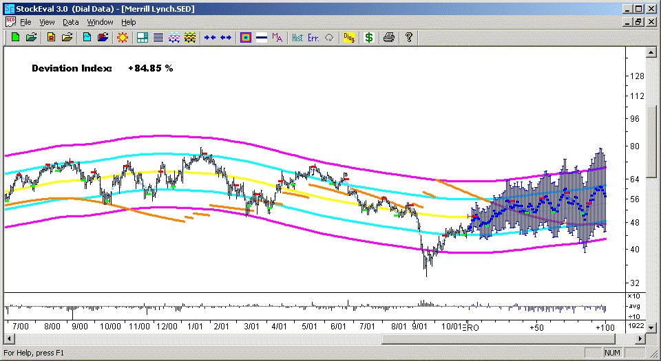
The yellow curve is the long-term Reference Curve, and the cyan and magenta curves on either side of it are the Bollinger Bands, corresponding to one standard deviation and two standard deviations, respectively. The black bars represent the historical high, low, and close price data. The sky-blue curve running through the data is the N-day smoothing curve, produced by the Savitzky-Golay digital smoothing filter. This curve is similar to a moving average, except that there is no time lag. The blue squares are the Price Projection, produced by the Linear Prediction routine. This should be interpreted as a plausible estimate of the future price action, based on the past price action. The blue bars are error bars representing one standard deviation, estimated from the price ticks of the Price Projection and the estimate of the daily Volatility from Linear Prediction. These error bars are approximately the same as those of the Random Walk model, to be conservative. The green and red rectangles are N-day buy/sell points, calculated as the maxima/minima of the N-day smoothed Trading Rules indicator (one of the Technical Indicators). You can vary these buy/sell points by varying the time scale and the trading parameters in the Trading and Portfolio Parameters dialog box. The buy/sell points in the Price Projection are estimated optimum times to buy and sell, whereas the buy/sell points in the past data merely serve to illustrate their method of calculation. The orange curve is the Theoretical Price, calculated from the historical earnings and discount rate data. Along the bottom is the logarithmic volume indicator, which shows the logarithmic volume relative to the average log volume. That way, you can tell at a glance whether the log volume is higher or lower than average. In the upper left corner is the Deviation Index, which measures whether the (smoothed) current price is higher or lower than the (smoothed) Price Projection from N days ago. Finally, the number in the lower right is the number of days of historical data in the stock data file.
If the Theoretical Price curve or the buy/sell points get in the way, they can be turned off by means of two check boxes in the Moving Averages dialog box.
If you go to the next higher scale (using the blue arrow buttons on the toolbar), the whole graph is scaled up by a factor of two:
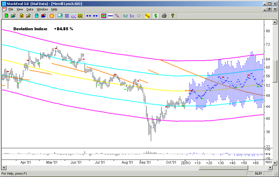
Notice how the slope of the graph at each point is the same as in the previous graph. The slopes of all graphs are on the same scale between different stocks and different scales of the graph, at all points in time. This slope is the percentage rate of change of the stock price, which is the primary number that is of interest in judging the stock performance. It is important to be able to compare this slope directly between the same stock at different times, and between different stocks. This seems to be a feature that is lacking in most charting software and printed stock charts.
The time scale for the historical data is displayed in months. The month of September is off a little because that month of trading was shortened by a week due to the 9/11 disaster, which was an anomalous event. The time scale for the future Price Projection is listed as days in the future, and the present time is listed as "ZERO". We decided to spell out the number "ZERO" everywhere in the program, to make it more prominent.
Notice the discontinuous jumps in the orange Theoretical Price curve. These correspond to changes in the discount rate. Each time the discount rate goes down, this is favorable for stock prices, and results in an upward jump in the Theoretical Price. The Theoretical Price is an estimate of where the stock price should be, based on Fundamental Analysis. For the majority of stocks, the actual price is quite a bit higher than the Theoretical Price, which indicates that part of the value of the company consists of "intangible value" apart from the actual earnings of the company.
Moving up to the highest scale, the display has some added features:
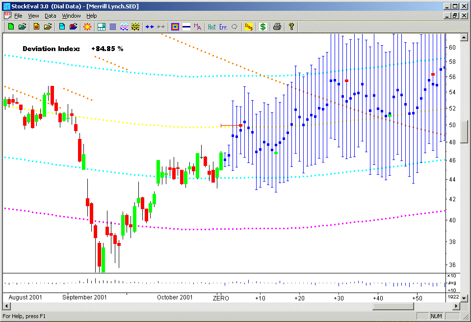
This is the best scale to use for very short-term trading. The first blue square and error bar after the last day of historical data is the estimated average price and volatility range for the upcoming trading day. (We define the average price to be the average of the high, low, open, close prices.) The estimated price and volatility range for the upcoming trading day for each stock are also shown in the Short-Term Trading dialog box, which is accessible anywhere in the program by right-clicking the mouse, or from the "sun" icon on the toolbar. These are useful for traders who want to time their trades intra-day to try to get a better price. The raw output of the Linear Prediction routine has been shown to have predictive power one day out, which is shown in the Short-Term Trading dialog box. For longer time intervals, the Price Projection must be smoothed on an N-day time scale, which results in the set of six technical indicators that we call the Harmonic Oscillator and Technical Indicators. These are useful for timing trades on a N-day time scale.
From the above graph, in the historical data the buy/sell points have been replaced by Candlesticks. These provide a graphical way to display the opening prices along with the high, low, and closing prices. The limits of the black line are the high and low prices for the day, whereas the limits of the colored bar are the opening and closing prices. If the close is above the open, the bar is green, and if the close is below the open, the bar is red. From this you can tell at a glance whether it was an "up" or "down" day. The differences between the closing and opening prices are also used in the Price Momentum technical indicator, along with the actual volume for the day.
Finally, by clicking the scale button three times, you can go down to the lowest scale, three factors of two lower in scale:
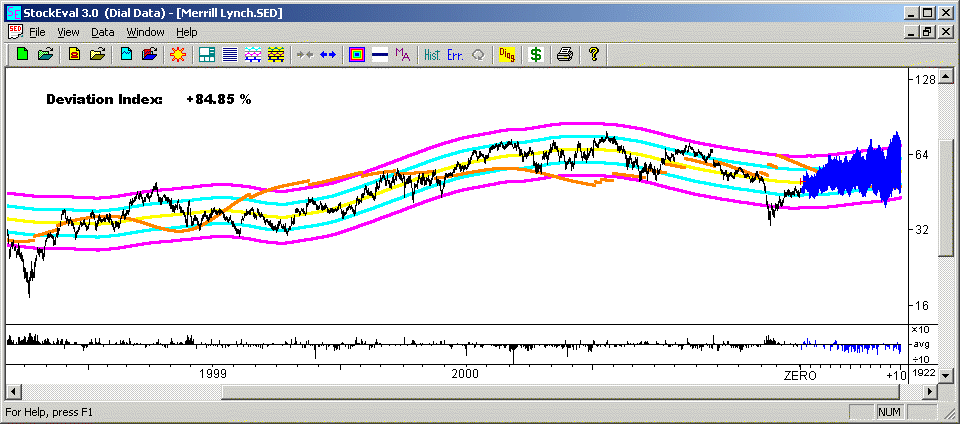
On this scale, each day of data occupies one pixel on your screen. This scale makes it easy to see the overall long-term performance of the stock at a glance. This is made possible because the whole four years of data are shown on one continuous graph. Once again, you can compare the performance (percentage rate of change of price) at all times just by looking at the slope of the graph.
It should be mentioned that on all graphs, you can move the vertical scale up or down to adjust the position of the graph. You can look at different parts of the graph corresponding to different times by moving the horizontal scale. On the horizontal scale, when you move the slider bar, the graph waits 1/10 of a second after you stop moving the bar, and then repaints the graph. It also adjusts the vertical scale each time you move the horizontal scale, to keep the graph centered in the view so that it doesn't "get lost". These features make it possible to display the entire price history of the stock in one continuous graph.
return to Demonstrations page